Also known as the “ham radio operator’s business card”, your QSL card should represent you properly, look nice and look professional. You can find tips on how to do this here.
QSL card design: tips and tricks
Pictures / Photos
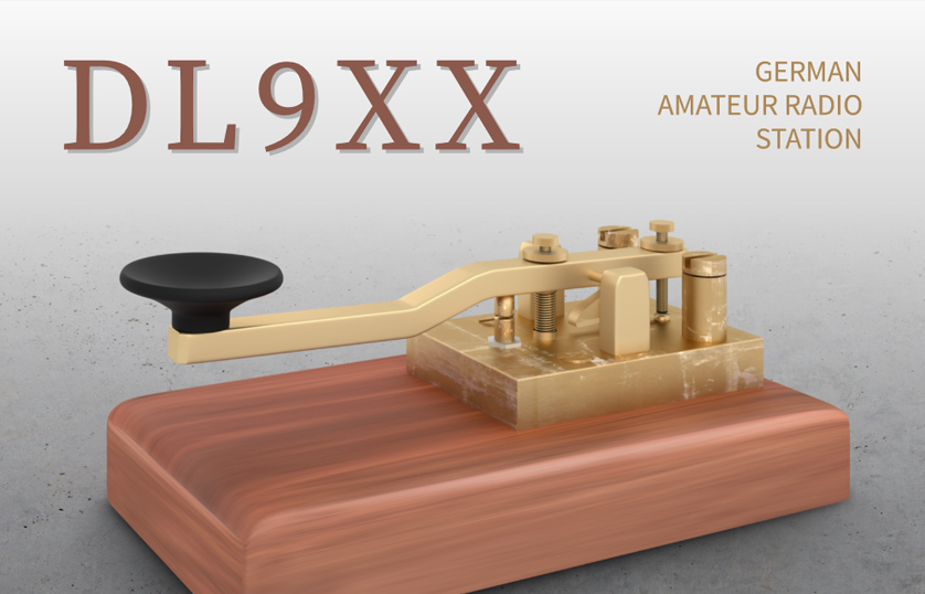
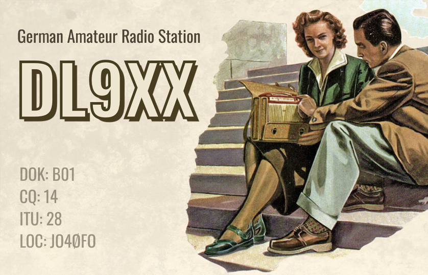
Motif for your QSL cards
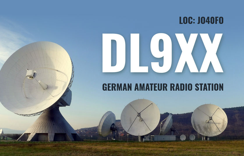
If you want to use a photo as an eye-catcher, first ask yourself if the image conveys the message you want. The image on your QSL card should also not be offensive or offend common decency. Otherwise, there are hardly any limits to your choice of motif. Personal photos of you and/or your technical equipment or your location and surroundings are often especially good.
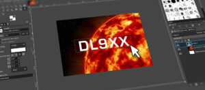
Image detail
The most important rule when choosing a crop: focus on the essentials, i.e. the areas that are crucial for the image. This way you can easily make disturbing elements invisible. Especially when shooting outdoors, there are often distracting details in the background. Despite all this, you should make sure that important areas are not too close to the edge of the image or even cropped and thus lost for the viewer and lose focus.
Photo quality
Another important factor that decisively influences perception is photo quality. A full-size background image on your QSL card should have image dimensions of about 1800 x 1200 pixels for optimal print quality. Cameras of current smartphones can easily reach this resolution.
Reasons for poor photo quality:
- The original image was photographed with low camera resolution.
- The quality was reduced by sending via email, WhatsApp or similar.
- The photo was copied from a Word or PowerPoint document.
- The image was downloaded from the Internet in poor quality. The quality of these images is insufficient in many cases.

Colors
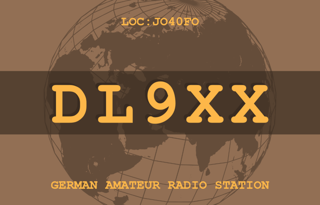
For the most part, the following also applies here: “Less is more”. Two to three colors are sufficient in many cases. These colors can be used in different brightness levels in case you need more variations without it looking too colorful and cluttered.
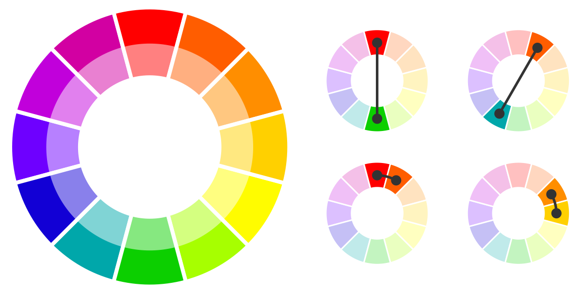
Color combinations
Not all colors combine well with each other. To see which colors work well together, you can use a color wheel. In color theory, there are two simple rules: All colors that are next to each other, and all colors that are opposite each other, go well together. In short: “Birds of a feather flock together” and “opposites attract”.
Contrast
When you place text on background images, readability often suffers.
Therefore, make sure there is enough contrast between the background and the text.
Typography / Fonts / Font sizes
Just as with the choice of colors, you should also limit the number of fonts and sizes used. If you want to emphasize areas differently, you can work with different font styles (e.g. bold and italic). Also, make sure that the text does not become too small and remains easy to read for people with impaired vision. In addition, the texts should maintain a certain minimum distance from the edge.
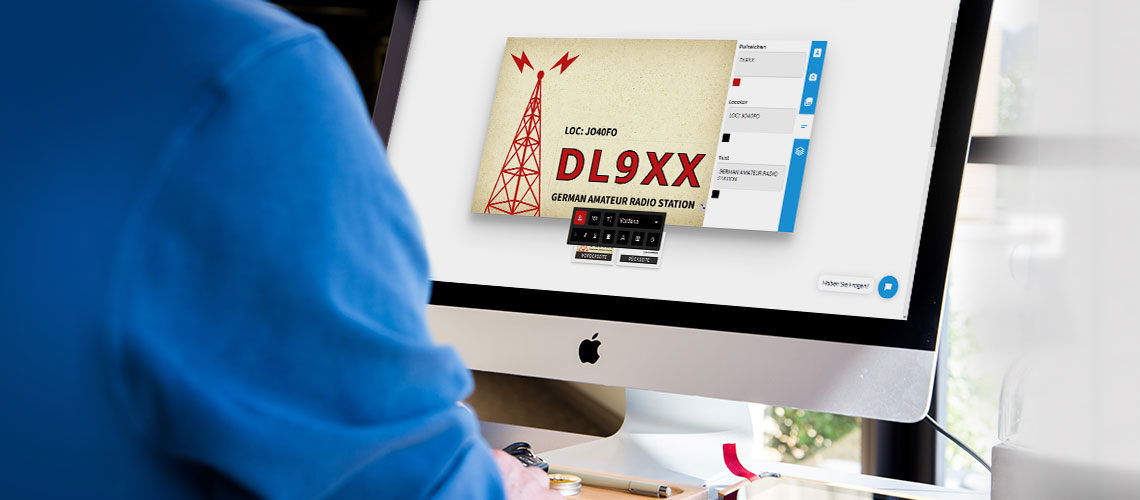
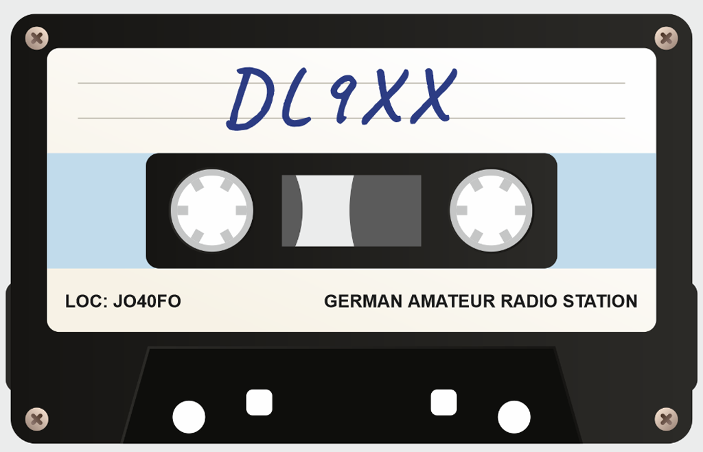
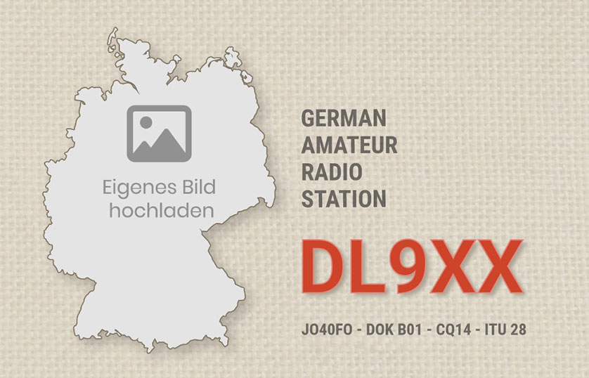
As a rule, your personal call sign should be in the foreground and displayed most prominently in both size and color. Many radio amateurs add the text “(German) Amateur Radio Station”, but this is not a must. Especially in combination with a suitable location photo, you can also complement the locator.
Be creative
There are hardly any limits to your creativity! For example, you can draw a motif for your QSL cards yourself if you are artistically talented.
In the end, your personal QSL card should also bring joy to the recipient and maybe it will even find a place on a living room wall here and there!
You can see some inspirations for QSL cards here.


Order and print QSL cards now
In our online designer you can easily design your QSL cards yourself. For the less creative radio amateurs, we offer a wide range of QSL card templates which can be easily customized.